What does “professional look” mean?
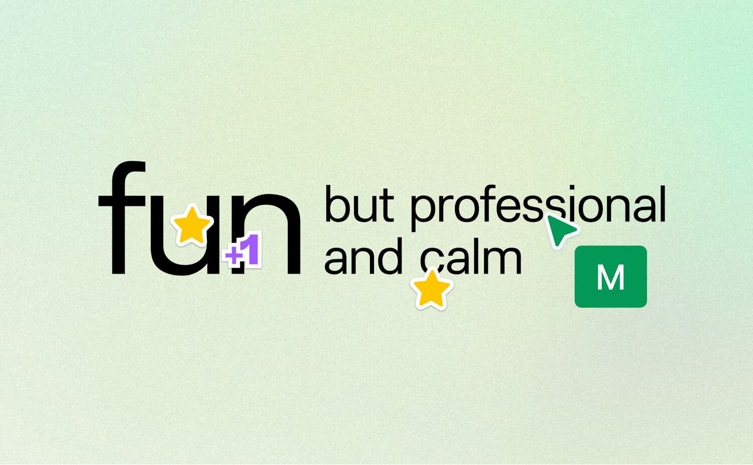
The cursor of a core developer hovered over the word "professional":
“I want to unpack how professional relates to us.”
The project’s advisors, who were involved in the brand direction workshop, upvoted this attribute to the top five, which surprised the building team.
“It has many meanings, some of which contrast strongly with what we should represent.”
I nodded. He is not the only one to think so...
"Professional" is a confusing term. In aesthetics too.
Here are the top 3 myths behind its perception and why they are not true.
Myth 1:
professional = boring.
This myth comes from “professional” organizations — huge consultancies, law and insurance firms, etc. — having a bland visual style.
Myth 2:
professional = slick or luxury.
This myth comes from fashion editorial culture and dates back to the 1930s.
Myth 3:
professional = minimal.
This myth comes from Swiss design pioneers like Braun and Rams and design-led brands like Apple.
The only true meaning is:
professional = executed with excellence.
For example:
- Attention to detail in production: accessible colors, smooth loading, correct hyperlinks, timeless t-shirt prints, durable book spines, etc. And yes! A bugless app.
- Brand consistency that you break at a precisely measured point, just before users are about to lose their attention.
- Easy-to-navigate architecture and a tested structure of even a complex (maximalistic) design.
When “professional” appears on your brand personality shortlist, it signals only one change – the end of the scrappy phase.
And your product can still remain in alpha. In an excellent alpha!
Wishing you an excellent start to the week,
Ira
No spam, no sharing to third party. Only you and me.




Member discussion