Minimum viable design, testing and other nuances of podcast covers
This is part three of the 4-issue guide to giving your podcast a visual style that gets noticed and gets talked about:
part 1 — The most beautiful podcast covers
part 2 — 5 things that shape a podcast's aesthetics
part 3 — this issue
part 4 — Template and resource list
Share this issue with them. "Hey. I'm reading this design newsletter, and the author wrote a guide for podcasters. I think you may like it: www.embracevariety.com/structure-of-podcast-cover/"
Main (show) cover
The main cover is a no-brainer. The only element it must include is the show logo. All the rest is optional.
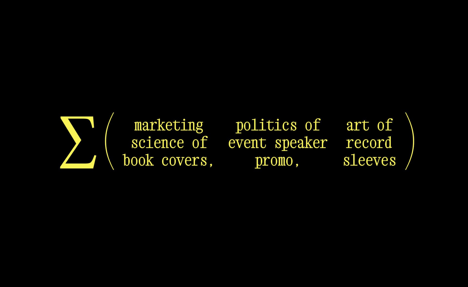
Since podcasting is a way to grow your brand awareness and thought leadership, consider adding the company name on the show cover. If you are a solo podcaster, add your name.
The results may look busy, but when you need to choose between marketing goals vs beauty, always choose marketing goals ¯\_(ツ)_/¯
What about the main graphic?
For branded podcasts, use your brand's visual language, because your podcast is one of the brand touchpoints. Flat brand color, gradient, any symbol or pattern from your past marketing materials will work.
If you are a solo creator, read this article by Spotify. I agree with everything they suggest.
When your design concepts are ready, test them:
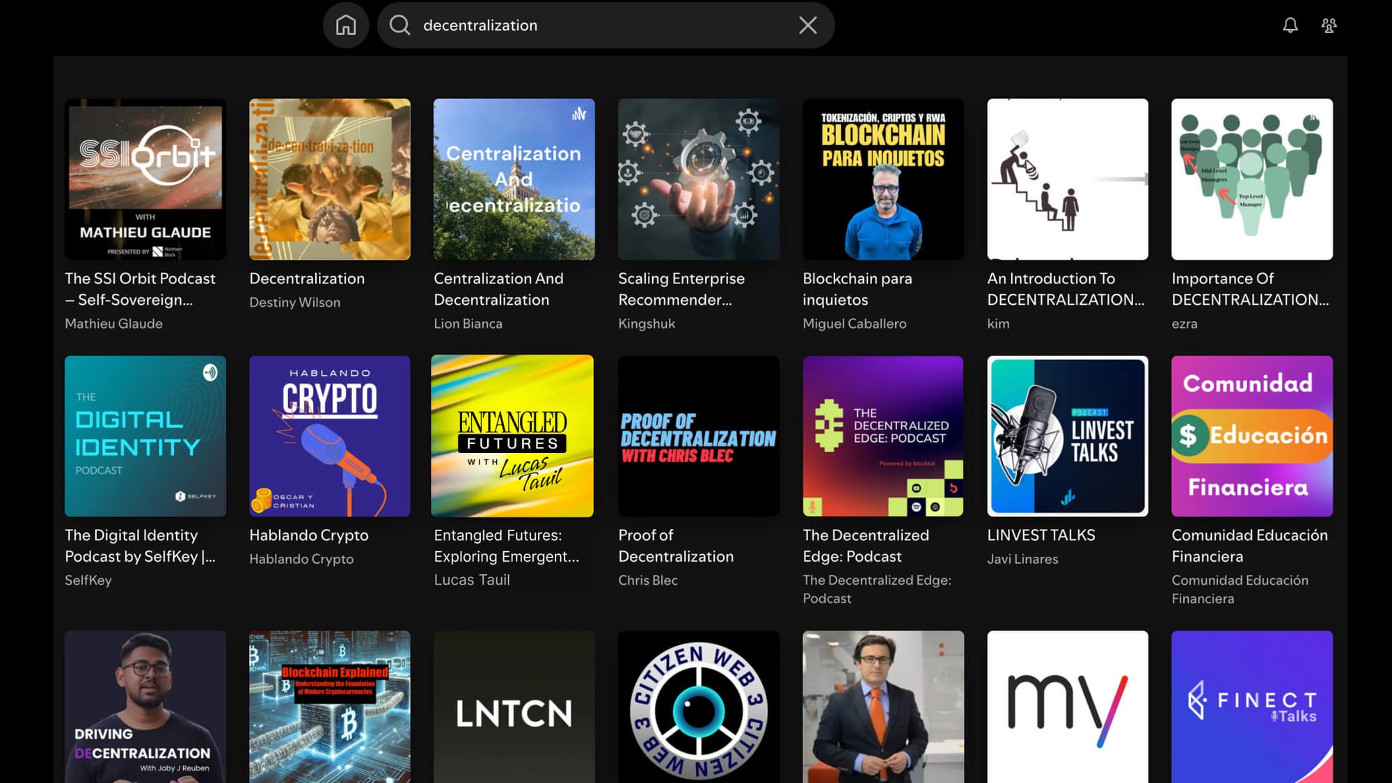
Make a screenshot of the search results from your category (see “Your show topic” in part 1). Then, place your cover over one of the shows in search results: Does it stand out?
Episode covers
Some podcasters use only the show cover for every episode. For example: 99% Invisible, The Tim Ferris Show, Six Pixels of Separation. This approach reduces design costs, of course.
But in the long run, I encourage you to embrace the variety: give every episode its own cover.
If you decide to do so, here are two aspects worth paying attention to:
- Design production cost. It ranges from "easy-to-replicate" (you can create covers using the template in Figma) to "requires a pair of design eyes and hands".
- Visual focus. It ranges from "focus on the host" (the cover mentions the guest name subtly) to "focus on the guest" (episode cover is all about your guest — photo, name, topic).
Here are a few examples to illustrate the matrix:
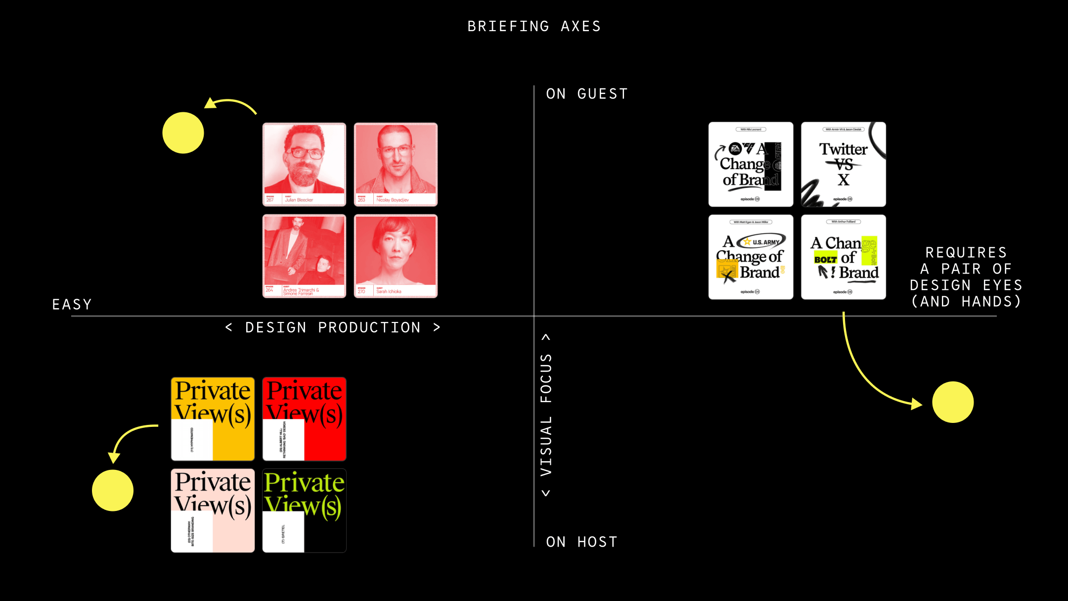
What is the ideal spot?
Choose "easy" even if today you work with a brilliant designer. The “easy“ design can be as beautiful and elegant as one that needs continuous supervision.
Focus on your guests as much as possible. Their authority boosts your own reputation, so giving them as much of your cover area as possible is the least you can do. Also, focusing on a guest leads to a higher rate of episode re-shares by the guest's followers.
To sum up
By now, you are 80% equipped to give your podcast a stellar look – with inspirations, strategy and tactics.
Two questions remain:
- What assets do you need?
- If you have a designer, how to brief them, so nothing is left behind?
I'll share this 2-in-1 resource with you on Friday.
See you soon,
Ira
No spam, no sharing to third party. Only you and me.
Member discussion