Perception matrix: symbols and styles
Every visual language — whether it belongs to a tech startup or the global cultural movement — consists of two core layers: symbols and styles.
Symbols carry meaning and historical baggage. Styles evoke emotions.
Together, they influence how we respond to visual messages. The perception matrix illustrates it for you:
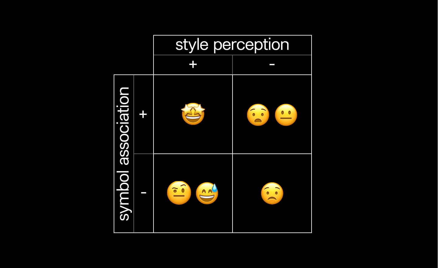
A positive symbol in a positive style brings joy. People want to surround themselves with what comes from this quarter.
A positive symbol in a negative style creates confusion and negative feelings. Think about toys used in horror movies.
A negative symbol in a positive style evokes emotions ranging from confusion to amusement. Amusement is good! Think about the spooky decorations and the overall hype about dressing up for Halloween.
And finally, a negative symbol in a negative style causes fear and disgust. People are trying to distance their everyday lives from everything in this quarter.
When you are working on the design direction for the brand, or even a tiny asset like an event cover for Luma, try to use this matrix: what symbols do you use, in what styles?
A question pops right away: Who is a judge?
The answer: Those for whom your THING is. Early adopters, if you launch a product. Developers, if you host a hackathon. Funders, if you are looking for financial support for your impact project.
In one of the following micro-lessons, I’ll show you how to understand what chosen symbols mean to your audiences and how the chosen styles make them feel. Once you know it, you are halfway to hearing their first “Yes!”
Stay tuned!
Yours,
Ira
No spam, no sharing to third party. Only you and me.


Member discussion