6 monochrome brands that look extremely good
On Monday you read about five reasons to choose a monochrome palette.
Although all the reasons are business- and cost-oriented, and should resonate with founders, a monochrome brand ID remains a rare find.
Why?
- Most people prefer colorful designs, and so brands try to appeal to as broad an audience as possible.
- Going monochrome is the boldest design decision you can make, and not every project is ready to take a risk.
- Removing the color from visual ID puts more pressure on typography, graphics, or layout, and not every project can find a designer who will create emotions and a vibe without colors.
And yet, beautiful monochrome brands exist!
Here are a few of my favorites:
teenage engineering
Although their UI is monochrome and hyper-minimal, they use full-color photography and include bold color accents in their products:
website
product + set design
the packaging (watch how the outfit matches the product design) + and one more
Spotify playlist cover. (Could also be a podcast cover if they had one!)
Fritz-Kola
Not a tech brand. But it has such a unique aesthetic and such a strong brand personality that I cannot help but include it here (I also love it personally!):
website
a few outdoor ads and a few more
the whole campaign
product photography
infographics
swag, and more swag, and one more that wows
swag collabs,
and finally, an old ad featuring Trump (although not a monochrome one).
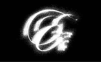
Are.na
A magic "cave" where you can easily get lost. You may not notice that Are.na is mostly black&white because you actually may not notice Are.na’s presence at all when browsing it. It’s a no-UI UI. Their swag is mainly b&w, and all annual books are printed in one color – black.
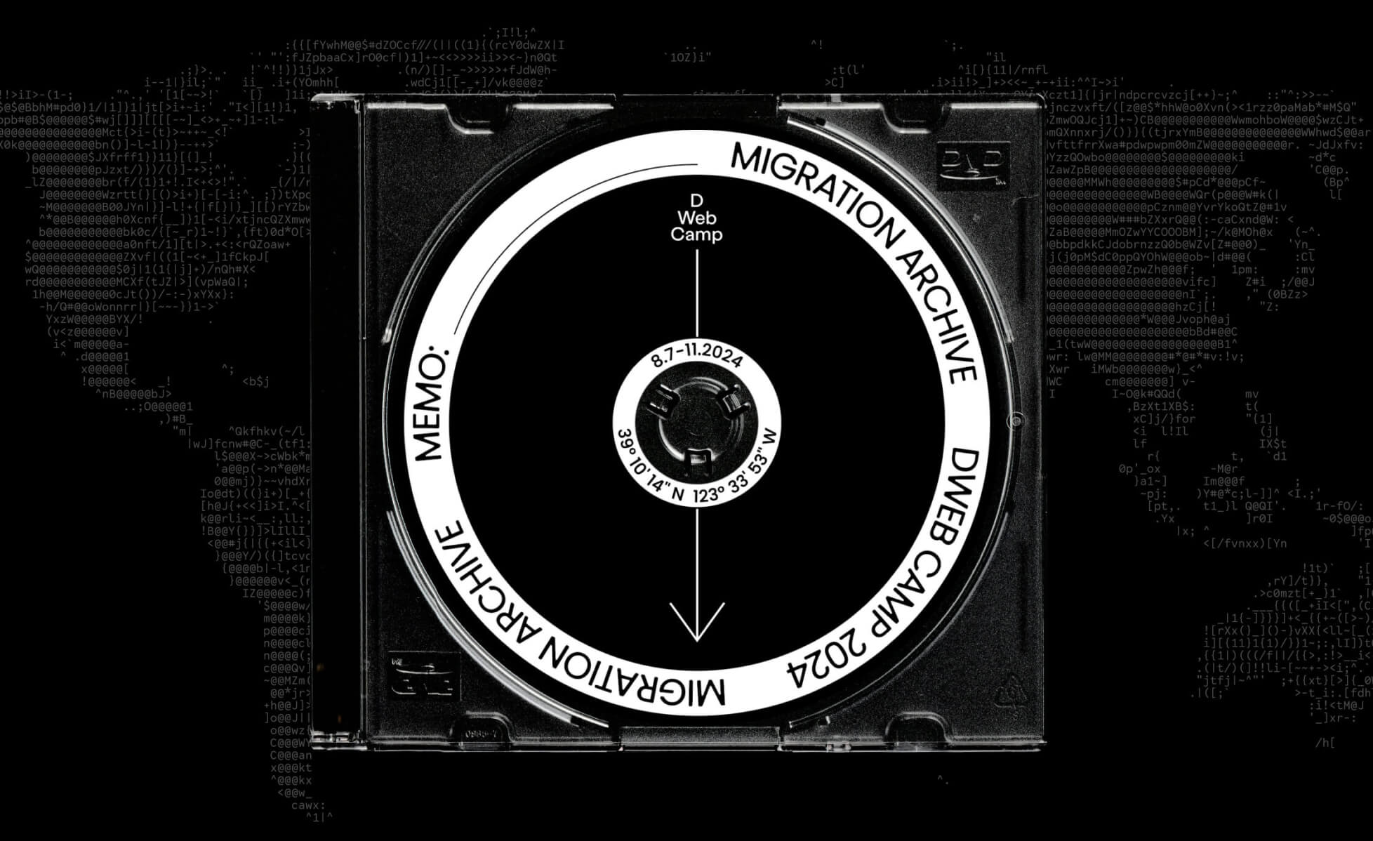
And now, a few remarkable events from decentralized tech. (Because of the DWeb Camps design, event visual comms are always on my radar.)
Protocol Berg
An icon of minimalism, academic-looking, clean. That's what you call "no-fireworks needed".
website
V2 event in 2025: signs and wayfinding, posters, wristbands, speaker announcement and.. popcorn!
and a bit of humor.
Web3 Summit
Web3Summit has been b&w and very minimal from the very first edition in 2018, through 2019 (graphics-based and text-based design) and remains b&w until today:
announcement 2025
quote design
wayfinding, space design and one more
speaker announcement 2019, in 2024 and in 2025.
Parallel Society Congress by Logos
I’m allowing myself to get more emotional here, saying: This is just stunning work! Many people who love colors and soft design may find it too sharp or too serious, or even too aggressive. But their aesthetics are somewhere in the heart of my personal Aesthetic Realm. Check it out:
event website
some of social media: event announcement and Twitter Space
simple infographics
video reel recap in b&w toning
some events on Luma.
That's all, Folks!
I hope you enjoyed this black&white issue of Embrace Variety ;)
Have a lovely weekend,
Ira
P.S. Do you have a favorite monochrome brand? Share it with me, and I’ll add it to this list, mentioning you as a contributor.
No spam, no sharing to third party. Only you and me.
Member discussion