"Gallery-style" design is good for attention health
If you build a digital product, your brand will have two visual dimensions – marketing visuals and the product UI.
Before potential users enter your building, they see a facade. This is your brand identity – on your landing page, on your social media, in your pitch deck. Your brand ID and web copy try to convince them to say their first "Yes!" and give your product a try.
If what they see and read convinces them, they may enter your building. It is the moment of clicking "Create an account", "Start a trial" or "Connect wallet". As they enter your building, they see its interior. It is your product UI.
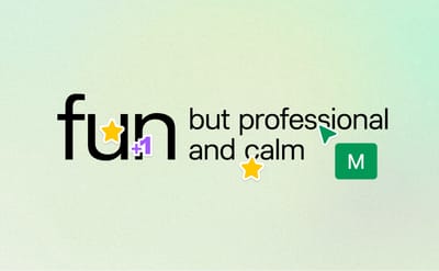
Last week I shared with you three reasons why monochrome brands are good for business. But in reality, even the most heavily cost-oriented reasons don't resonate with people who love colorful designs.
If it sounds like you, nothing should hold you back from building a colorful brand. Go wild! (Unless your audience has different aesthetic preferences.)
But does it apply to your product UI?
Not always.
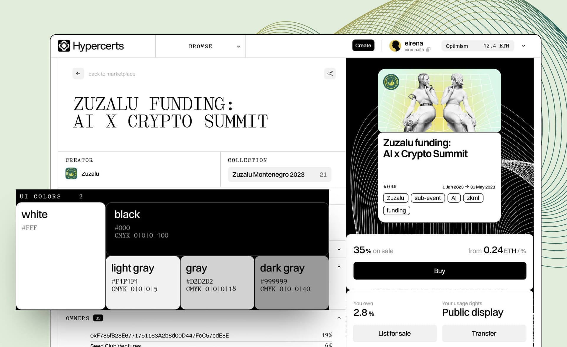
There is one health-related reason to choose a monochrome approach in UI, regardless of how vibrant your brand is: when your product is filled with visually rich content created by others or with products from other projects.
Creator economy, cultural products, magazines, bookstores, a big part of ecommerce, app marketplaces and social media fall in this category.
Think about museums and galleries. They are mostly monochromatic. These no-color environments allow you to focus on the content itself — the artwork. Which is, of course, good for an artist because their work gets your full attention.
But it's also good for you because your mind doesn't exhaust itself processing visual information from two layers — the message on the artwork and the vibe of the environment.
This approach is called "invisible" or "gallery-style" UI.
The takeaway
Your users live in a noisy world.
However colorful your marketing is, if your product features other products or projects, when choosing UI colors, ask yourself:
How can I reduce this noise and care about my users' attention health?
Monochrome UI may be the answer.
Stay healthy,
Ira
No spam, no sharing to third party. Only you and me.


Member discussion