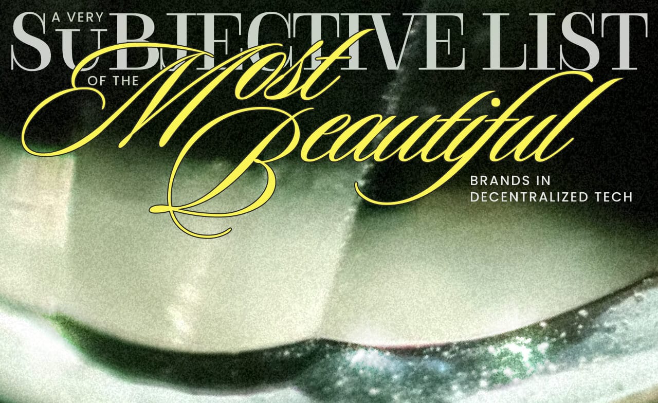
A subjective list of the most beautiful brands in Web3 ⋅ EV#006
When I joined Web3 in early 2018, it looked aesthetically primitive. An off-trend visual identity with a unique concept core and seamless visual system was a rare find. I started collecting the most beautiful brands in our space, just for myself.
After 4 years of slowly growing my list, the opportunity to share it with someone arrived.
When I joined Protocol Labs as a Creative Director of their in-house brand studio, I needed to find a way to curate and fuel our creative excellence. So, I introduced weekly creative jams and used my list of the most beautiful brands in Web3 as a warm-up for our inaugural session.
It was two years ago. Since then, some brands have rebranded, for better or for worse. I added new names and removed a few old ones.
It is a very subjective list. "Beauty is in the eye of the beholder," as it goes. This means that the list below is influenced by what I find beautiful. You may think differently, and that's okay. That's how aesthetics work.
On the other hand, 15 years in visual branding and my "aesthetic chromosome" (as one founder said) allow me to notice in seconds what many others may overlook.
So, here they are, in no particular order, the brands that I refer to when saying "Web3 is becoming beautiful, at last":
Hiro
One of the best examples of using ASCII for a commercial product I have ever seen. There is a lot of wit and elegance in how they used such a simple and technical through line: 1, 2, 3.
Devcons by Ethereum
Both Devcon 6 and Devcon 7 can serve as a reference point for weaving local culture into global events. Many brands forget about local vibes when "going abroad".
Anytype
The beauty of type, high contrast, and the electric mix of pixel art, soft colors, and grids.
Kraken
The only Web3 brand that didn't make me roll my eyes looking at their shift to 3D illustrations. Continuously changing, forever young, with perfectly executed marketing illustrations and using a single-color palette, never in a boring way.
DragonFly Ventures
Brutal, sharp, uneasy, and a bit noisy. But after exploring it for a bit, you start feeling the system. It has a good rhythm of white space and noise. And do you see we have ASCII again? ;)
Privy
They did a nice rebranding. The web layout is clean and nothing special, but the introducing more art (even just a tiny bit) to the tech space always brings me joy, and I hope they will keep doing it, even more.
Wormhole
Extra-clean, a bit of an authoritative feel, a well-curated balance of loud type and an overall stoic feel because of the whitespace and healthy rhythm of background contrast and minimal visuals.
Ledger (legacy)
Ledger used to be sharp, bold, and a bit intimidating (like some lines of Nike) with illustrations dancing at the edge of minimalism. Now they are doing it in a safe way, but the legacy is still alive and I hope they will stay with this direction: 1, 2, 3, 4, 5.
Gitcoin (sometimes)
Gitcoin was one of the first ones to break through the blockchain visual cliches and electric colors with their mycelium theme and very earthy designs. Since the phase of nature-inspired direction ended in 2024, its design goes with ups and downs – from elegantly minimal to more universal and emotionless. Because we don't know what strategy drives these changes, we can only cheer when visuals bring us aesthetic pleasure or pause and wait in the times of more safe design.
Friends With Benefits
A visual cacophony, but undoubtedly neatly curated. It is what people call "a poetic web" and "trash design" that is actually state-of-the-art and self-expression: 1, 2, 3.
Additionally, the creator economy and NFT brands.
The visual beauty of an NFT-focused brand should be a default. It's the creator economy, after all. Imagine a fashion designer who does not care about their outfit. That's why I'll be extra-brief unpacking what's good in every single visual language of the following brands. Explore it!
Mona
Their rebranding is an example of typographic excellence and layout dynamics: 1, 2, 3, 4 and 5.
Zora
A simple sphere is one of the worst shapes you can use for a logo because it is overused. But they turned it into a universe of logo looks: 1, 2, 3, 4, and the cherry on the top. (And event this one is orb.) Additionally, I'm adding them here for the unusual brand typefaces and well-balanced (rhythm and clearspace space) editorial layout.
Metalabel
Metalabel is no longer a Web3 brand, but they used to be, and I'm leaving them here for the long-lasting effect of visual wit and the variety of styles that don't overwrite or collide with each other: 1, 2, 3.
Thanks for reading this far. I hope all the links in this long post will bring you aesthetic pleasure and confidence in a more beautiful future for the decentralized web.
See you next week!
Ira
No spam, no sharing to third party. Only you and me.
Member discussion