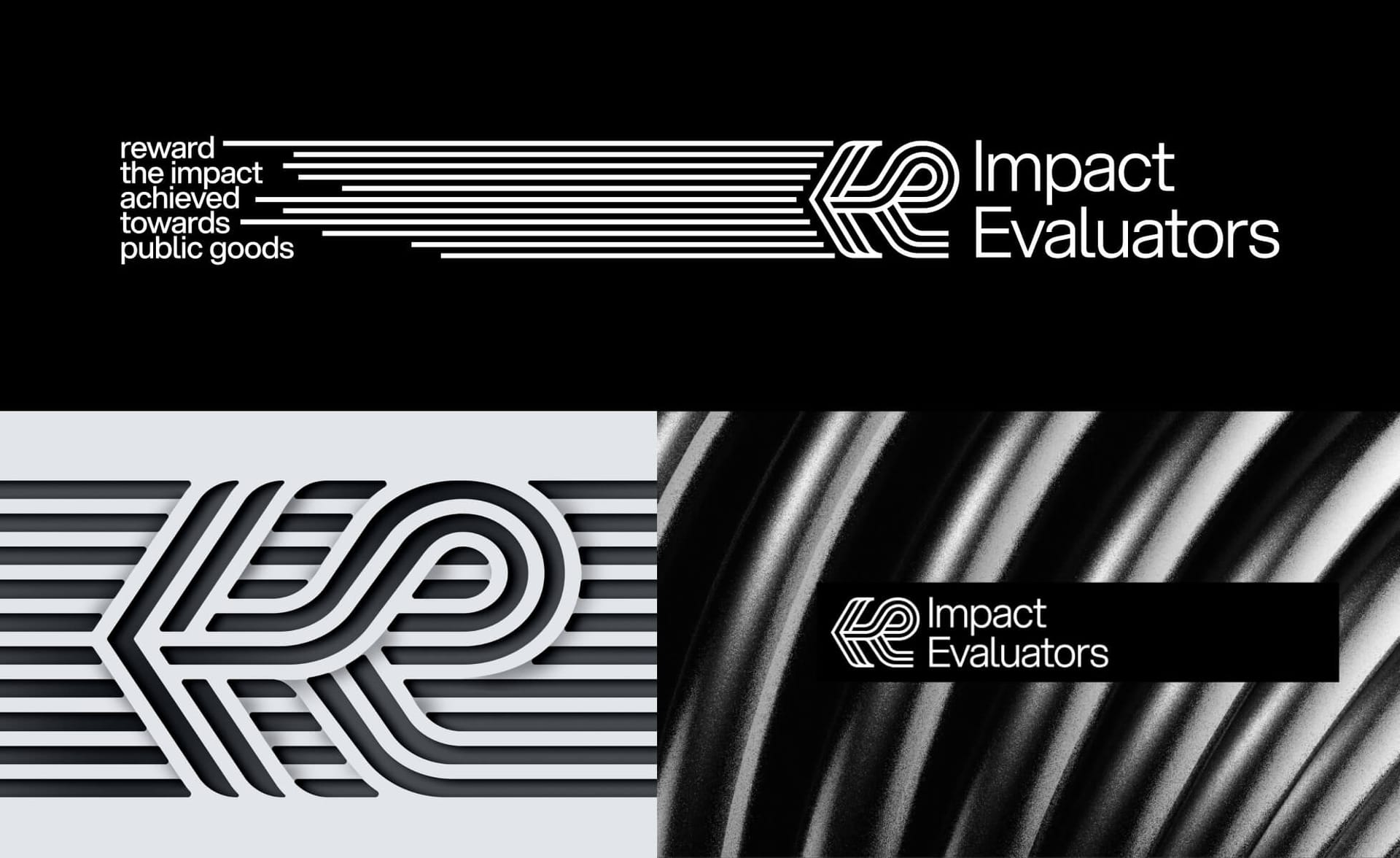
5 reasons to choose monochrome
People prefer colorful designs over monochrome. Designers know it.
And yet, a designer may still suggest a monochrome palette for your brand. For all five or at least one of the following reasons:
It looks more sophisticated and elegant. Black&white design conveys more premium quality than colorful design executed with the same excellence. Plus, this kind of minimalism signals brand confidence to people.
It stands out in almost every setting. Whether it's an expo area (think about neighboring stands trying to outshine each other with colors) or a natural environment (think about camps and outdoor conferences).
It works through media, for everyone. Monochrome will be printed and displayed everywhere and, as the most accessible color combination, will be seen by everyone equally. And no one is going to mess with your brand colors by using the wrong color version of your logo or choosing the wrong shade of blue for your swag.
It's timeless. Black and white brands get rebranded less frequently. Rebrands from colorful to monochrome are common, while vice versa are rare.
It's budget-friendly and planet-friendly in production. Whatever medium you use, monochrome is always cheaper to produce than 4-color or custom Pantone. And monochrome websites are CO2-lighter than the same layout and content in a colorful "packaging".
That's all for today, but the monochrome topic doesn't end here. Next week, we'll get back to it – with a focus on your users, your product UI, and everyone's health.
Have an elegant start to the week ;)
Ira
No spam, no sharing to third party. Only you and me.


Member discussion